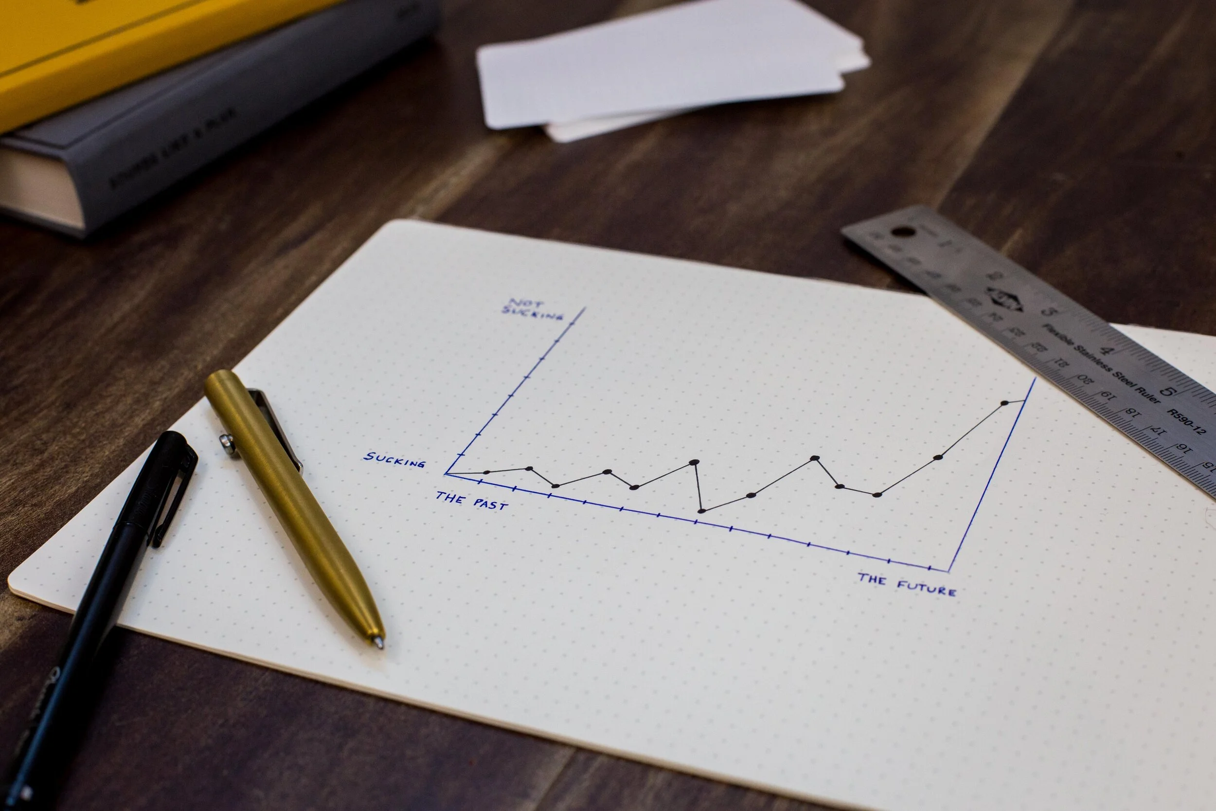
Showing school data trends through a dashboard
Photo by Isaac Smith on Unsplash.
Challenge
Examining performance trends over time helps to show where schools are struggling and succeeding, but educators and administrators in the NYC Department of Education couldn’t do this easily with the existing reports. Because those reports focused on results for one year, they would need to download and review multiple reports, and copy down numbers on their own to carry out multi-year analysis. In addition, the existing reports presented data in tables and text, making it hard to spot patterns and come away with insights.
How might we help educators and administrators analyze multi-year data trends and identify areas to focus on?
Process
We created a project brief that outlined key user needs and scenarios, and held a design challenge for team members to create prototypes. We evaluated the prototypes by testing them using a realistic hypothetical scenario—preparing a senior administrator for a school visit, including looking up key data points and identifying questions to discuss with the principal. We took the most promising prototype and added the best features from the other ideas. We conducted more user tests, and iterated more on the design and content.
We built the dashboard as an interactive web report, using D3 for data visualizations. We conducted trainings and feedback sessions with principals, field staff, program staff, and administrators.
Outcome
We released the School Performance Dashboard, which shows multi-year data and includes visualizations. It was our team’s first interactive web report—and a major technological advance from the previous PDF and Excel reports. The report has been lauded by educators and administrators as a powerful tool for analyzing school performance, and receives over 100,000 unique page views per year.
My Role
I was the initial product manager and led the design and development of this dashboard. My role and responsibilities included creating the project brief, creating the main design prototype used for the eventual product; collaborating with a design/UX analyst on product design; collaborating with a design/UX analyst to conduct user tests and synthesize results; creating business rules and technical requirements; managing product development by developers; and conducting trainings and feedback sessions. In subsequent years, other team members have served as the product manager and made further improvements.
Project Artifacts
School Performance Dashboard screenshot
This section includes information on school programs, the student population, school conditions and practices, results over time, and the school’s impact and performance.
School Performance Dashboard screenshot
This section includes data visualizations about specific metrics (such as math test scores). The user can select different metrics to view.
School Performance Dashboard screenshot
This section shows results from the past four years on a variety of metrics, with color coding to show results above and below average.
Project brief
Excerpt from the project brief describing user needs and stories.
Prototype
An early prototype that I created for critique and testing.
Usability testing scenario
We used this scenario—using the dashboard to help a senior administrator prepare for a school visit—to assess how well the dashboard worked.


